Silverlight 2 Release Candidate Now Available
This evening we published the first public release candidate of Silverlight 2.
There are still a small handful of bugs fixes that we plan to make before we finally ship. We are releasing today's build, though, so that developers can start to update their existing Silverlight Beta2 applications so that they'll work the day the final release ships, as well as to enable developers to report any last minute showstopper issues that we haven't found internally (please report any of these on the www.silverlight.net forums).
Important: We are releasing only the Silverlight Developer Runtime edition (as well as the VS and Blend tools to support it) today, and are not releasing the regular end-user edition of Silverlight. This is because we want to give existing developers a short amount of time to update their applications to work with the final Silverlight 2 APIs before sites are allowed to go live with it. There are some breaking changes between Beta2 and this RC, and we want to make sure that existing sites can update to the final release quickly once the final release is out. As such, you can only use the RC for development right now - you can't go live with the new APIs until the final release is shipped (which will be soon though).
You can download today's Silverlight Release Candidate and accompanying VS and Blend support for it here. Note that Expression Blend support for Silverlight 2 is now provided using Blend 2.0 SP1. You will need to install Blend 2.0 before applying the SP1 service pack that adds Silverlight 2 support. If you don't already have Blend 2.0 installed you can download a free trial of it here.
Beta2->RC API Updates
Today's release candidate includes a ton of bug fix and some significant performance optimization work.
Today's release candidate also includes a number of final API tweaks designed to fix differences between Silverlight and the full .NET Framework. Most of these changes are relatively small (order of parameters, renames of methods/properties, movement of types across namespaces, etc) although there are a number of them. You can read this blog post and download this document to get a listing of the known API breaking changes made from the Beta2 release.
We have updated the styles of the controls shipped with Silverlight, and have also modified some of the state groups and control template names they use. When upgrading from Beta2 you might find it useful to temporarily remove any custom style templates you've defined, and get your application functionality working using the RC first - and then after that works add back in the styles one style definition at a time to catch any rename/behavior change issues with them.
If you find yourself stuck with an question/issue moving from Beta2 to the RC, please report it on the www.silverlight.net forums (Silverlight team members will be on there helping folks). If after a day or two you aren't getting an answer please send me email (scottgu@microsoft.com) and I can help or connect you with someone who knows the answer.
New Controls
Today's release candidate includes a bunch of feature additions and tweaks across Silverlight 2, as well as in the VS and Blend tools targeting it. In general you'll find a number of nice improvements across the controls, networking, data caching, layout, rendering, media stack, and other components and sub-systems.
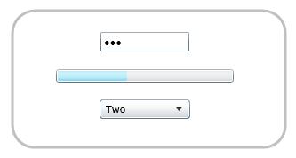
Over the next few months we will be releasing a lot of new Silverlight 2 controls (more details on these soon). Today's release candidate includes three new core controls - ComboBox, ProgressBar, and PasswordBox - that we are adding directly to the core Silverlight runtime download (which is still only 4.6MB in size, and only takes a few seconds to install):

At runtime these controls by default look like:
The ComboBox in Silverlight 2 supports standard DropDownList semantics. In addition to statically defining items like above, you can also use databinding with it. For example, we could define a "Person" class like below:

And the add a ComboBox to a page like so:

And then write the below code to databind a collection of Person objects to the ComboBox (by setting its ItemSource property):

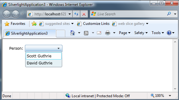
At runtime our simple app will then display the data-bound Person names (note that we set the DisplayMemberPath property on the ComboBox above to display the "Name" value from our Person objects):
We could then implement a SelectionChanged event handler like below to run code when a person is selected from the ComboBox:

Notice above how we can retrieve a reference to the selected "Person" object from the databound ComboBox using the ComboBox's "SelectedItem" property.
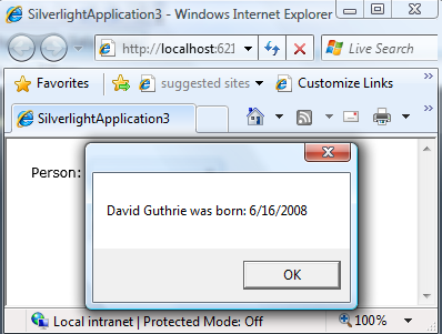
We can then call the MessageBox.Show() helper method (new in the RC) to display a modal dialog box that displays some details about our selected person:
New Control Skins
The final release of Silverlight 2 will have a much more polished set of default control template skins than those that were in Beta1 and Beta2. Our goal with the default control templates is to have a look that is professional and attractive, can be used in the majority of applications as-is (without requiring you to author custom style templates), and which is also easily tweakable using Expression Blend.
Today's RC build has skins that are close to the final look we plan to ship (there are a few final tweaks we are doing post RC on the focus color of controls, as well as to tighten up and tweak a few issues in some of the control templates). Below is the default look for the DataGrid, RadioButton, CheckBoxes, and the DatePicker controls with today's RC build:
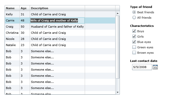
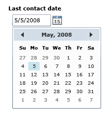
Note that the DatePicker control above allows users to type in a date (with a masked edit to ensure it is a valid date), or they can click the calendar icon to the right of the textbox and select the date using a popup Calendar control:
One of the most powerful features of Silverlight and WPF, of course, is the ability for designers and developers to completely customize the look and feel of any control. This goes beyond simple styling of colors and fonts - you can literally completely change the visual UI of a control, as well as customize its behavior (for example: add animation) without writing any code.
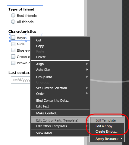
Within Expression Blend, simply right-click on any Silverlight control and choose the "Edit Control Parts" sub-menu to open and edit its control template:
When in control template editing mode, you can manipulate any sub-element of a control (for example: a checkbox's inner content), as well as customize each "state" its in (notice the states pane circled in red below). This allows designers to customize what the control looks like in individual states (for example: checked, unchecked, mouseover, etc). Silverlight will then automatically handle animating the control from state to state depending on the user action:
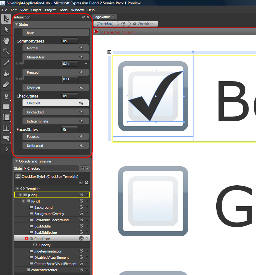
You can learn more about how Silverlight's Visual State Model works from my previous blog post here.
Previous releases of Silverlight often rendered graphics on sub-pixel locations - which could cause lines and shapes to sometimes appear "fuzzy". The RC of Silverlight has a new features called "layout rounding" that causes the layout system to round the final measure of a control to an integer ("pixel snapping"), which results in crisper lines and fewer rendering artifacts. This feature is now on by default, and helps make applications look nicer.
Summary
The final release of Silverlight is not that far off now. It has been a pretty amazing project that has come a long way in a pretty short amount of time.
If you have existing Beta2 applications, please start getting them ready for the final release - as once we release Silverlight 2, users that have existing beta releases installed will automatically be upgraded to use the final version. Testing your application out with the release candidate will ensure that you can easily update your applications and have them ready within hours of the final release.
Let us know if you find issues with today's release candidate, and please make sure to post them on the forums on http://www.silverlight.net.
Hope this helps,
Scott